MacBurger is a website design concept for a modern burger brand, built around one question: what if fast food were designed with the same care as consumer tech? The result is an energetic, high-contrast site that sells the experience as much as the food.
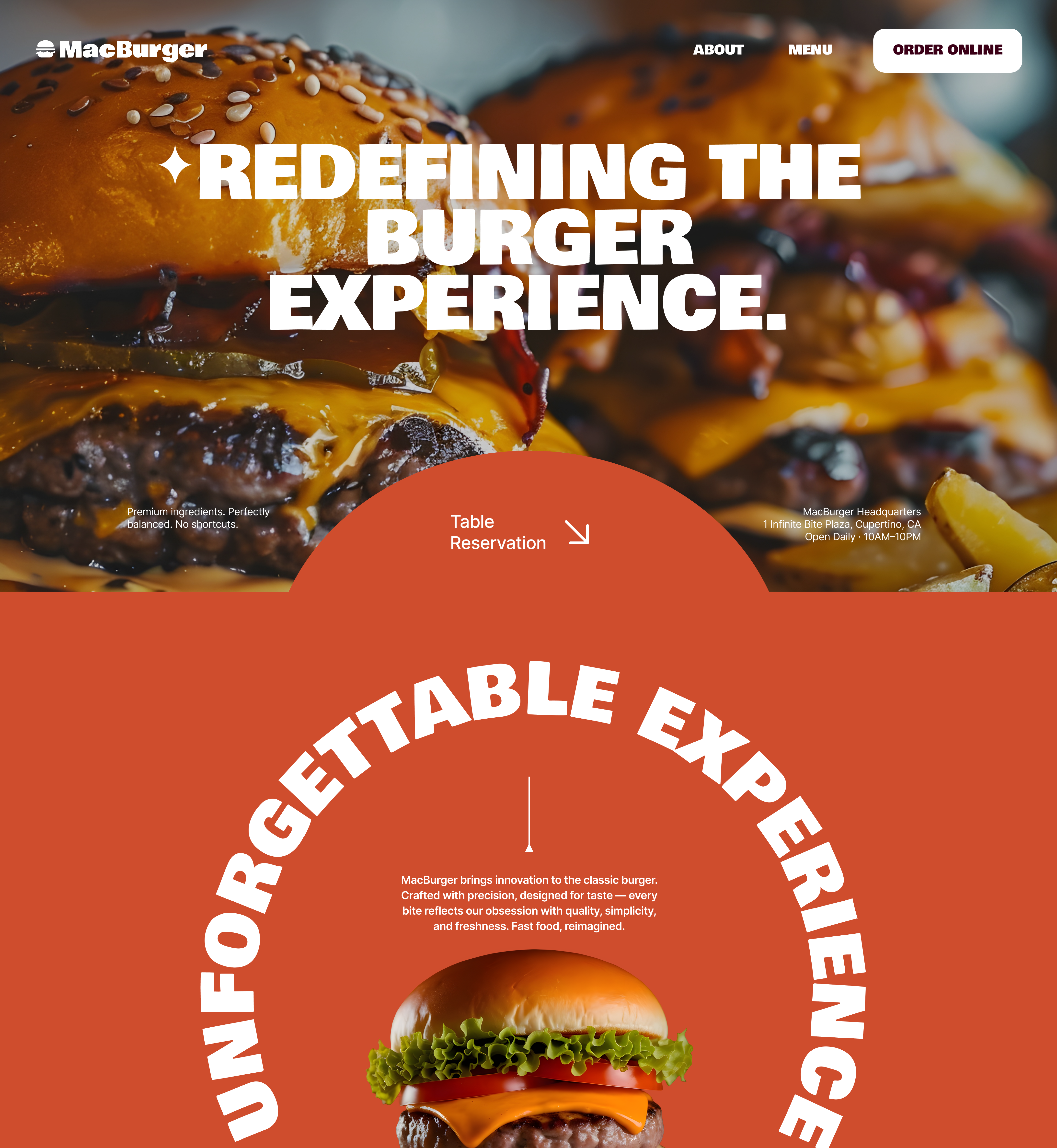
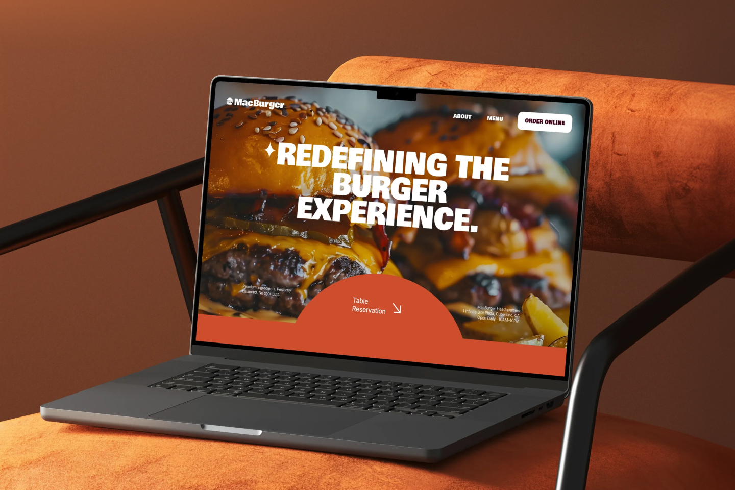
The homepage opens with a full-bleed burger photograph and a heavy display headline, “Redefining the Burger Experience,” with a clear “Order Online” button in the navigation and a “Table Reservation” shortcut in an arched shape below. Directly after, a curved “Unforgettable Experience” headline wraps around a hero burger, turning a simple product shot into a memorable brand moment.
The page then moves through a structured flow:
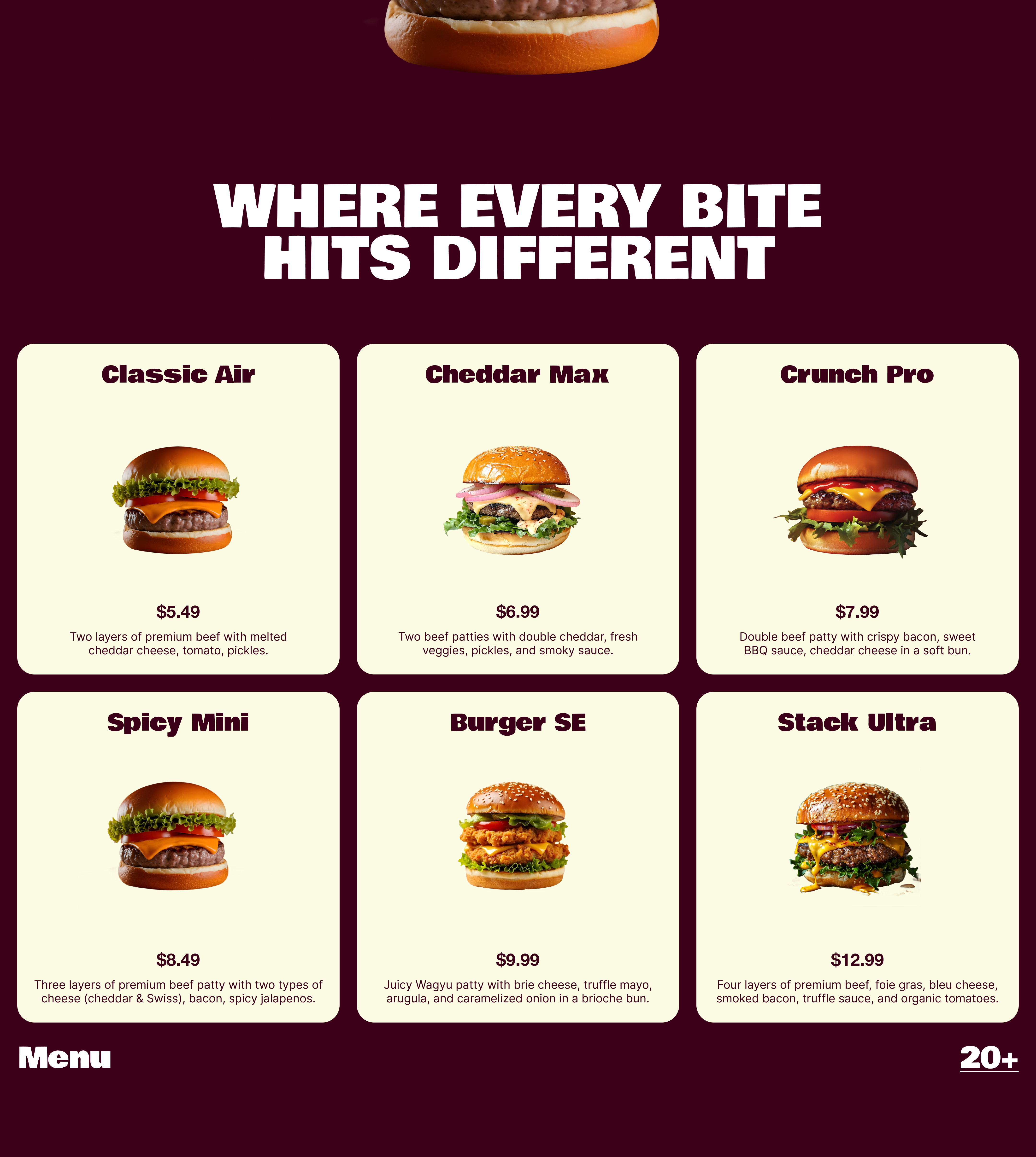
- Menu showcase: Six burgers presented as a product lineup (Classic Air, Cheddar Max, Crunch Pro, Spicy Mini, Burger SE, Stack Ultra), each with a photo, price, and short description on clean cream cards
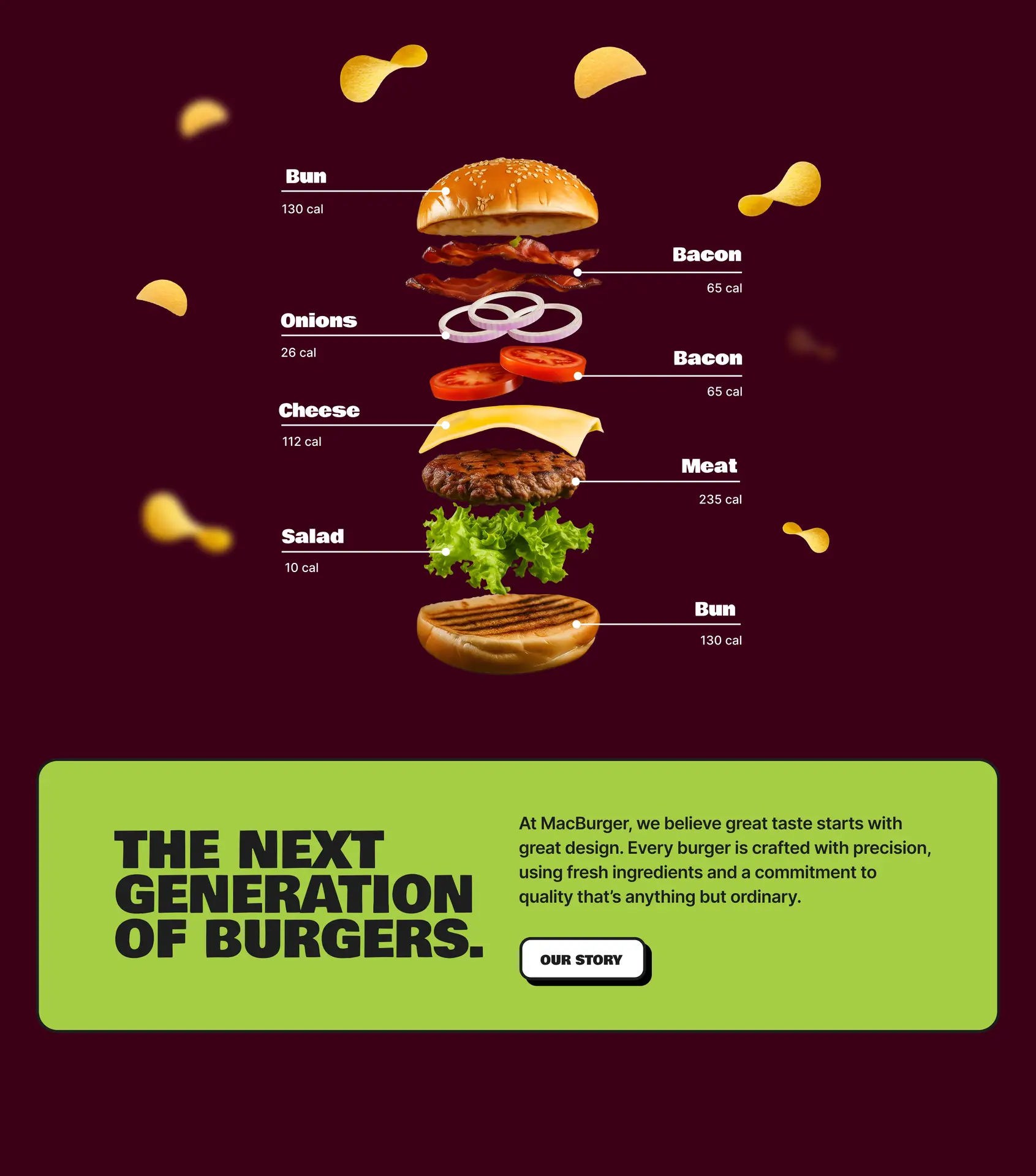
- Exploded burger diagram: A layer-by-layer breakdown with calorie labels, borrowing the “inside the product” visuals tech brands use, with floating chips adding motion and playfulness
- Brand story: A lime-green block with a punchy statement and “Our Story” button, giving the brand a voice
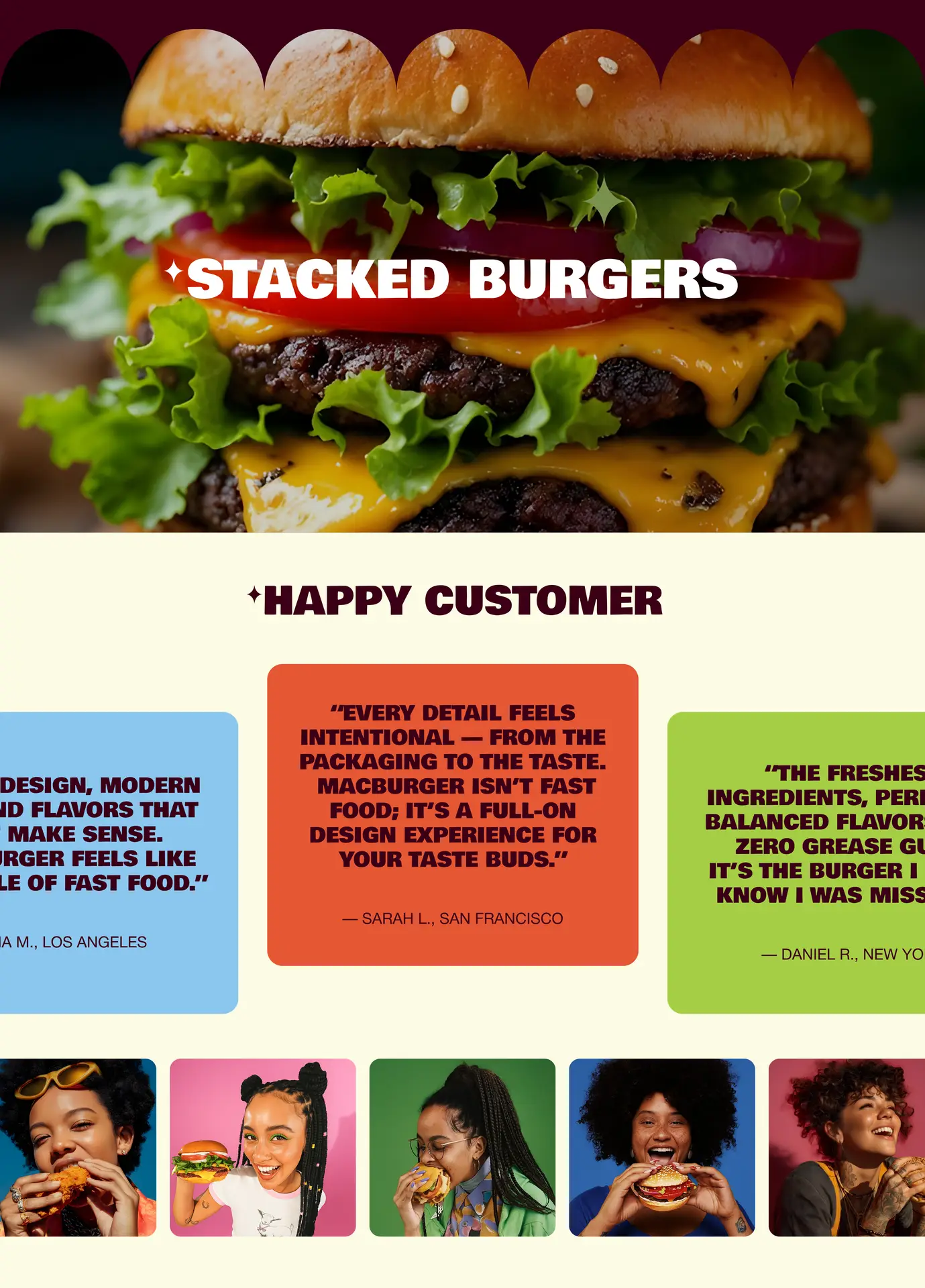
- Full-width visual break: A close-up “Stacked Burgers” image that makes the food the hero
- Social proof: A scrolling row of colorful testimonial cards, backed by photos of real-looking customers enjoying their burgers
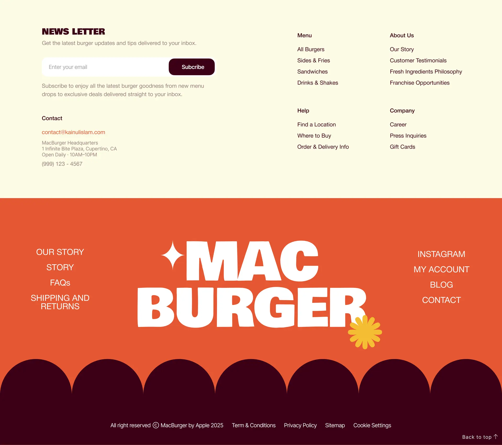
- Footer: A newsletter signup, organized navigation, contact details, and an oversized logo with a scalloped edge that echoes the bun
The visual system stays consistent throughout: chunky uppercase headlines, rounded cards, bold color blocking, and curved shapes that mirror the burger’s own form. The playful tone is balanced by clear hierarchy, so visitors can browse the menu, learn the brand, and take action without friction.